
Website experience
Luma
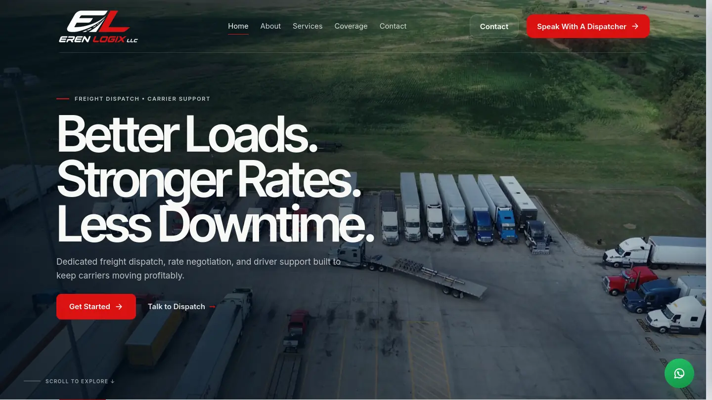
An internal FusionAura Studio concept exploring editorial web design through warm product photography, refined typography, immersive layouts, and responsive frontend development.
Visit live site- Category
- Internal Concept
- Year
- 2026
- Services
- Website Design & Development · Brand & Digital Experience
- Technology
- React · JavaScript · Vite
Project overview
Luma, in context.
- Year
- 2026
- Project type
- Internal Concept
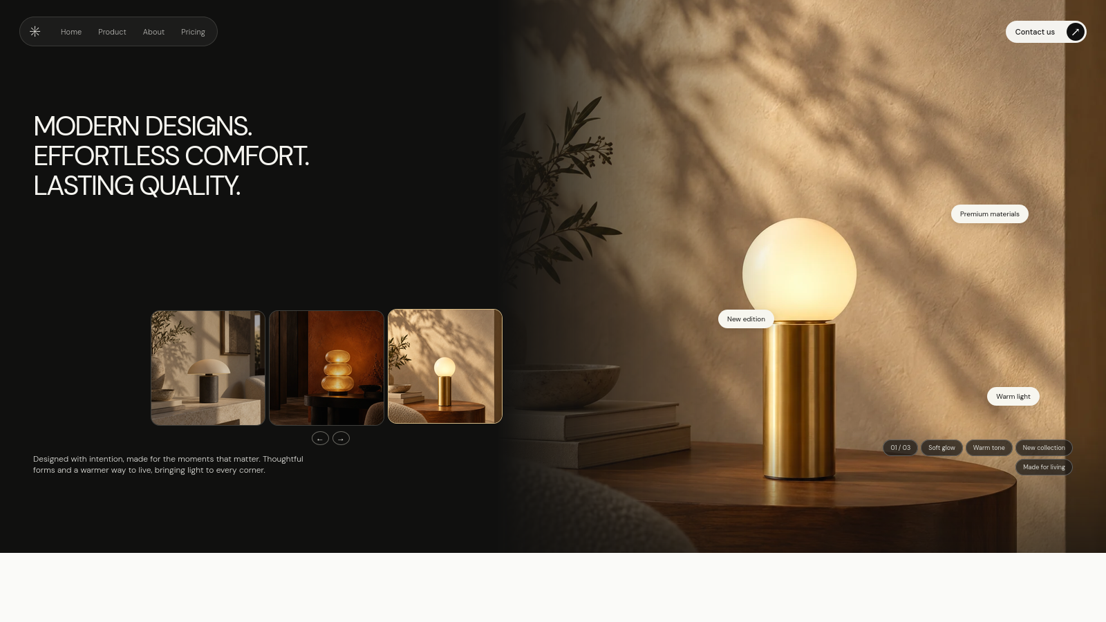
Luma is an internal FusionAura Studio concept created to explore how product photography, typography, spacing, and responsive composition can shape a premium digital experience.
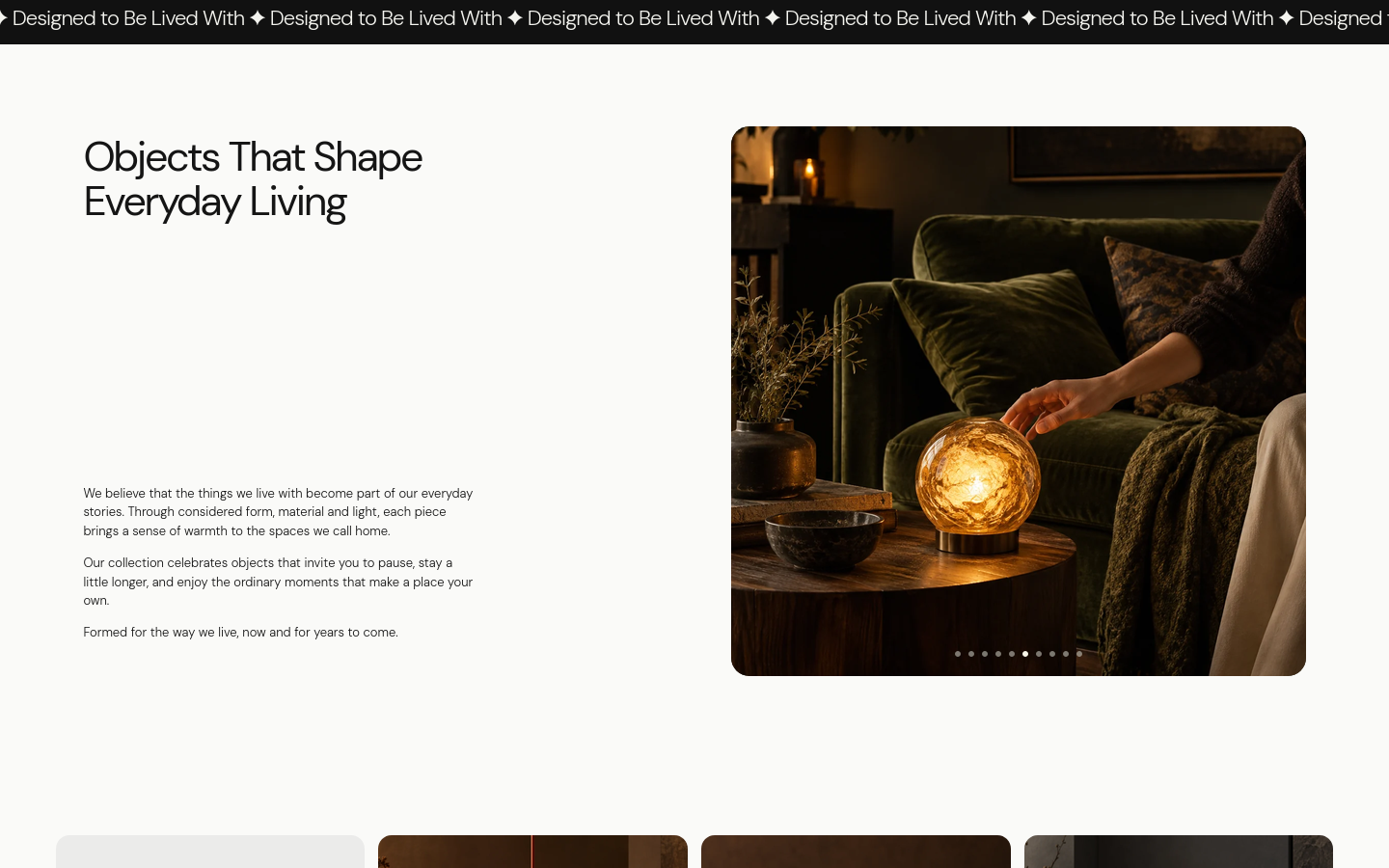
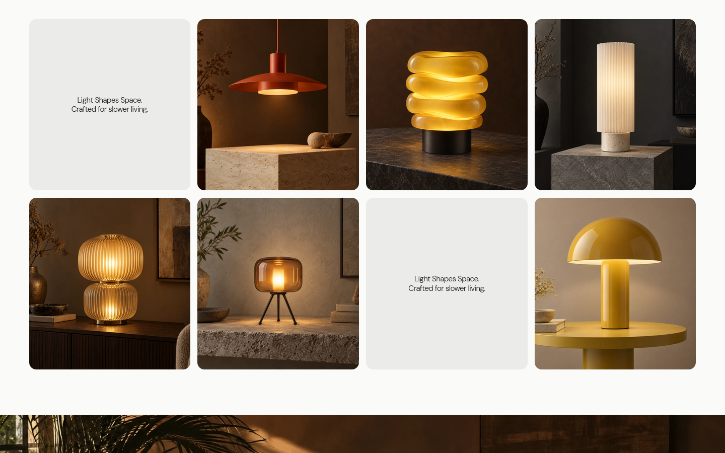
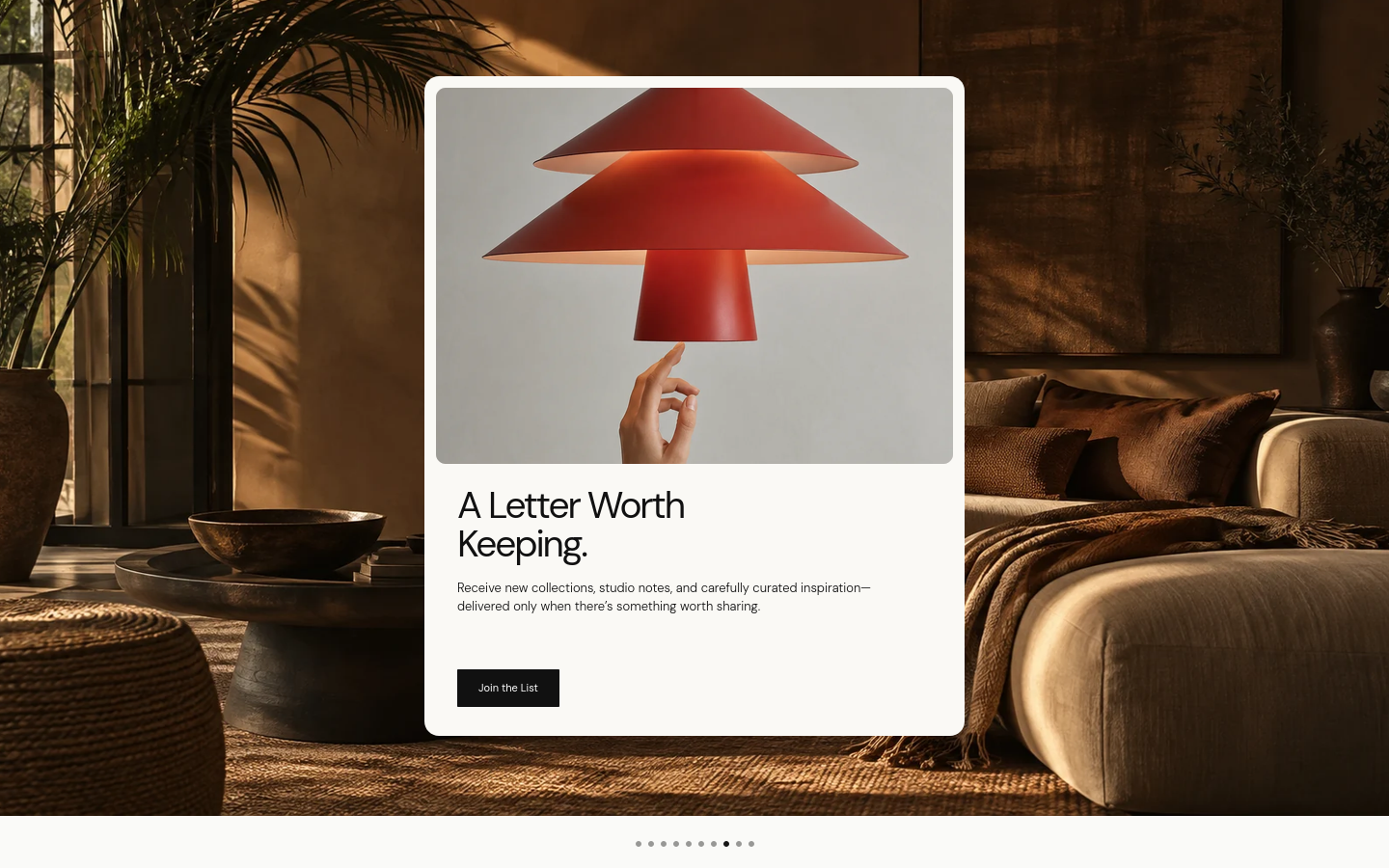
The website presents a fictional contemporary lighting collection through an image-led interface, combining dark cinematic sections with warm editorial layouts and restrained interaction design across desktop and mobile.
This case study describes verified project scope and delivered work. It does not make unverified external outcome claims.
Project system
Services and technology.
Technology
- React
- JavaScript
- Vite
Approach
How the project came together.
We approached Luma as a digital art-direction and frontend exercise rather than a conventional ecommerce website.
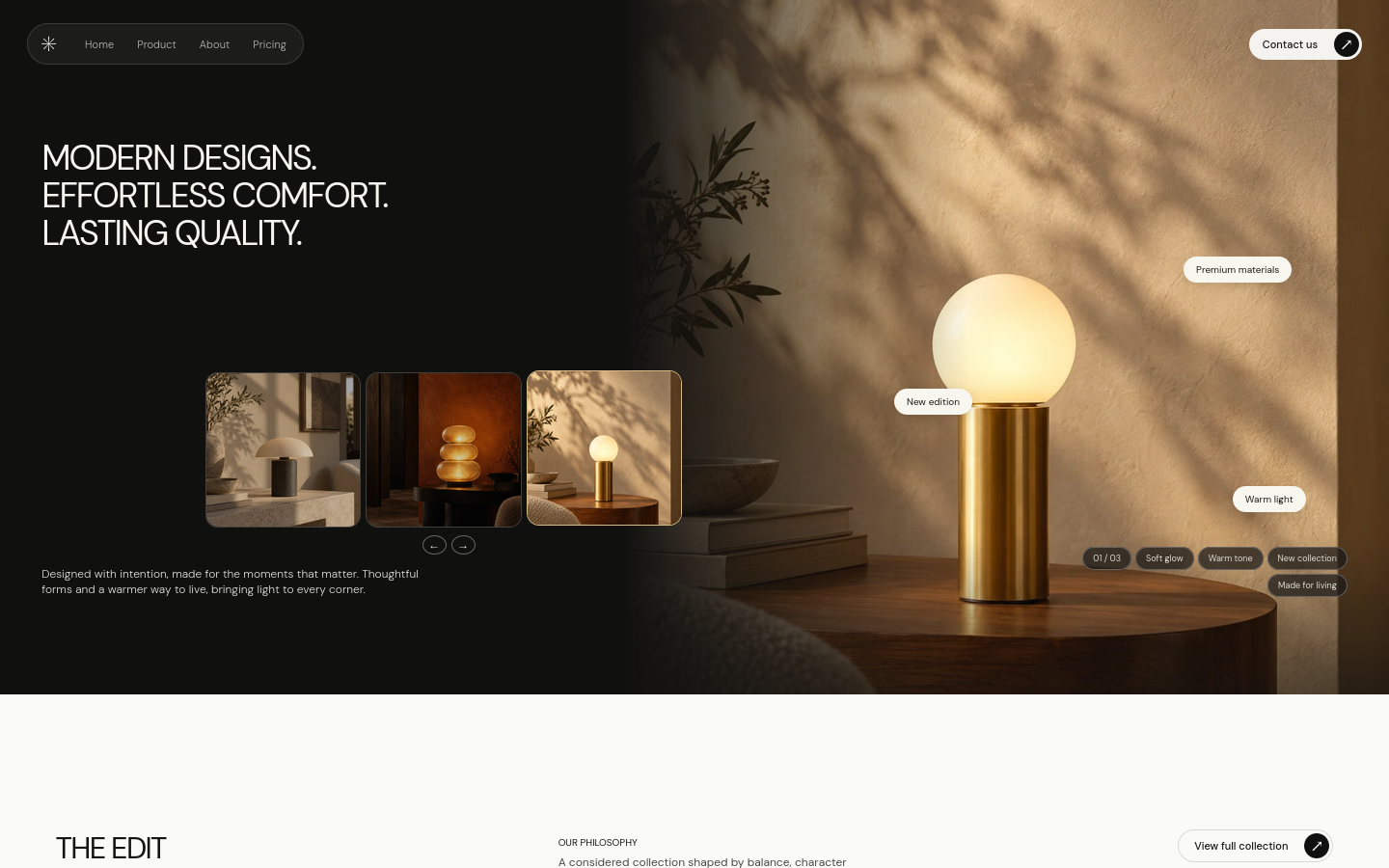
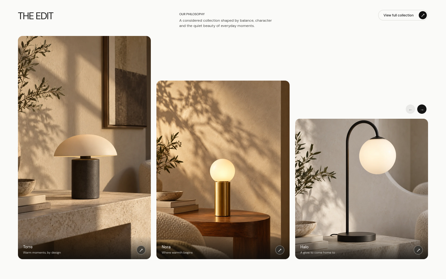
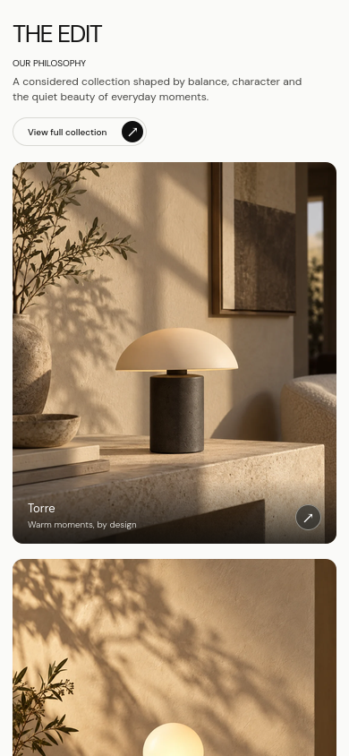
The visual system was built around warm product photography, neutral typography, compact interface controls, modular product layouts, and deliberate negative space. Each section was composed individually so the experience could retain its visual hierarchy across different screen sizes instead of simply scaling the desktop layout down for mobile.
The final interface was implemented as a responsive React/Vite experience with particular attention to image treatment, spacing, typography, and subtle interaction.
Interface study
A closer look.
Explore the selected project views with swipe, trackpad or keyboard controls.
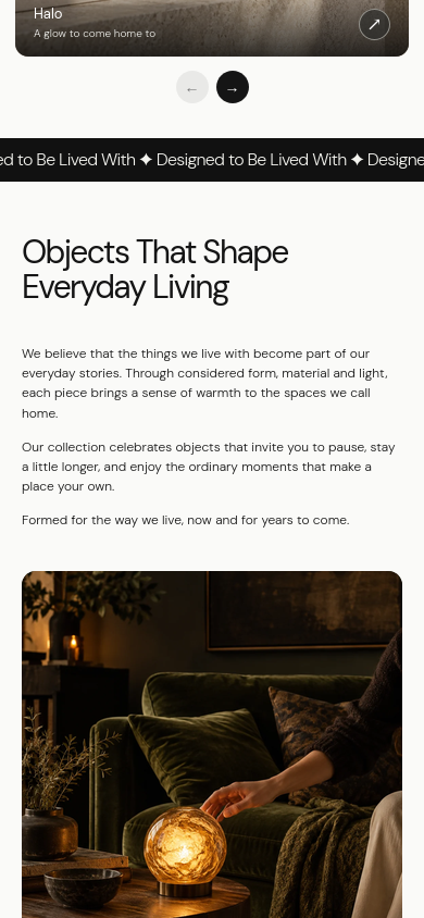
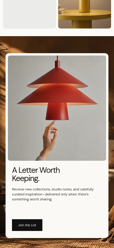
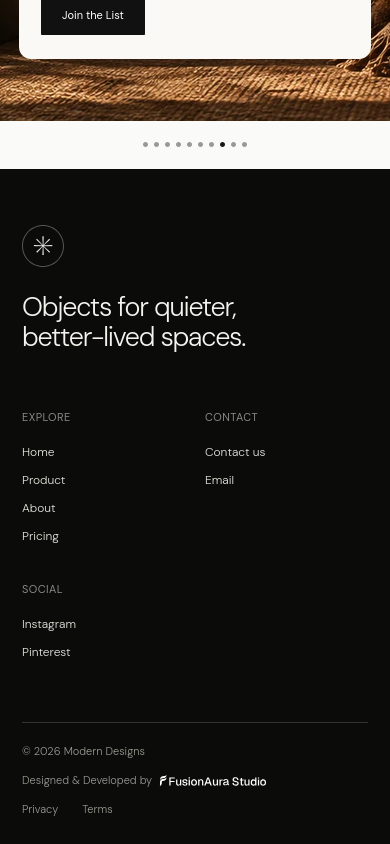
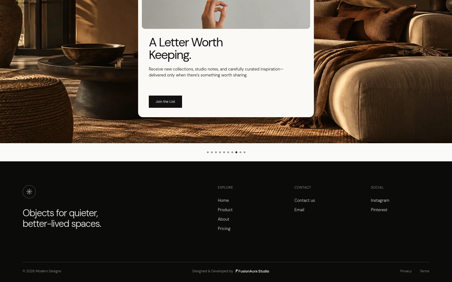
01of10
Drag or swipe to explore
Outcome
The result is a polished internal showcase demonstrating FusionAura Studio’s approach to premium web design and frontend development.
Luma delivers a cohesive experience across desktop and mobile while keeping photography, editorial hierarchy, responsive composition, and restrained interaction at the centre of the design.
Start a project
Ready to build something useful?
Tell us what you are planning and where you need support. We will respond with practical next steps.