
A business can become more experienced, more capable and more valuable while its website stays exactly where it was three years ago.
That gap is usually where the redesign conversation begins.
The problem is not necessarily that the website looks “old.” Plenty of simple websites work extremely well. The problem is when the site starts presenting a weaker version of the business behind it: the offer is harder to understand, the work looks less credible than it really is, important services are buried, or a visitor has to work too hard to figure out what to do next.
That is when a website stops being a neutral piece of marketing infrastructure. It starts creating friction.
This guide explains when a website redesign is actually justified, when a smaller refresh is the smarter decision, and what you should protect before rebuilding anything.
What actually counts as a website redesign?
A redesign is more than changing the colours, replacing the hero image and choosing a newer font.
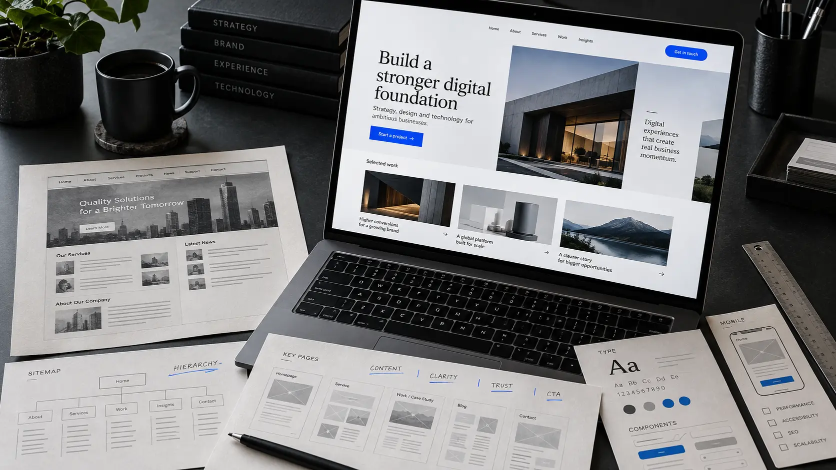
A proper website redesign can change the way the site communicates the business: its information hierarchy, navigation, page structure, messaging, visual system, calls to action, content presentation, responsive behaviour and sometimes the technology underneath it.
That distinction matters because many websites do not need a complete rebuild.
If the structure is sound and the real problem is a weak headline, dated photography or an unclear call to action, replacing the entire website may create more risk and cost than value.
Before asking, “Does this website look modern?” ask a better question:
Does this website represent the business as clearly and convincingly as it should?
If the answer is no, work out why before touching the design.
1. Your business has changed, but the website still describes the old version
This is one of the clearest reasons to redesign.
Businesses rarely stay still. Services change. Better clients arrive. A company moves upmarket. A specialist offer becomes the main offer. A local operation expands. A simple service business starts building software, offering consulting or handling larger contracts.
The website often lags behind.
You can end up with a company capable of handling serious work being represented by pages written when it was still trying to explain the basics.
Look at the homepage without using what you already know about the company. Would a first-time visitor understand what the business does now, who it is for and why it is worth considering?
If not, this is not primarily a cosmetic problem. The website’s structure and message may no longer match the business.
2. A visitor cannot understand the offer quickly
A homepage should not make people decode the company.
This sounds obvious, but vague positioning is common:
“Innovative solutions.” “Quality you can trust.” “Taking your business to the next level.”
None of those statements tells a visitor what is actually being sold.
A stronger page establishes the offer early, then earns the right to explain it in more detail.
For a commercial roofing company, “Commercial roof repair for businesses across Georgia” is immediately useful. For a freight dispatch company, the visitor should quickly understand who is being supported and what the company handles.
Clarity is not boring design. It gives design something meaningful to emphasise.
If your current page needs several paragraphs before the offer becomes obvious, rewriting one line may help. If the confusion runs through the navigation, services and page hierarchy, the problem is probably structural enough to justify a redesign.
3. The website makes the business feel interchangeable
This is harder to measure than a broken form, but it is easy to recognise.
Open five websites from the same industry. Remove the logos. Could the same homepage belong to any of them?
Many business websites use the same formula: stock photograph, broad headline, row of three service cards, a few icons, testimonial slider and contact block.
There is nothing inherently wrong with that structure. The problem appears when nothing about the experience reflects the actual company.
A strong website should create recognition through more than a logo. Typography, imagery, writing, pacing, proof, interaction and page composition can all reinforce what kind of company the visitor is dealing with.
That does not mean making everything unusual. It means making the important things specific.
When we work on service-business websites, the aim is not to decorate a standard template until it looks expensive. The more useful question is: what should someone understand and feel about this particular business before they contact it?
4. The website no longer creates the level of trust the business needs
Trust on a website is not created by adding a shield icon beside the words “trusted provider.”
It comes from dozens of smaller signals lining up.
Is the offer specific? Is the writing clear? Is the work visible? Do names, contact details and company information feel legitimate? Are claims supported? Do pages look maintained? Does the interface behave predictably? Are there obvious mistakes?
Research from Stanford’s Web Credibility Project is now more than two decades old, so it should not be treated as a measurement of 2026 user behaviour. But its underlying finding remains useful: visual design, usability, visible expertise, real-world identity and ease of contact all influenced how participants judged website credibility. Stanford’s published guidance specifically highlighted professional design, useful navigation, visible expertise and making it easy to contact the organisation. :chatgpt-content-reference{index="1"}
That is also why “make it look premium” is too shallow a redesign brief.
The objective is not to manufacture trust through appearance. It is to present the real reasons the business deserves trust more effectively.
5. Your proof exists, but the website hides it
A surprising number of websites make large claims and then bury the evidence.
The homepage says the company is experienced, reliable or results-driven. But the projects, process, specialist knowledge, client stories or tangible examples that would support those claims sit three clicks away—or are missing entirely.
Claims are easy to write. Evidence does more work.
Depending on the business, useful proof might be completed projects, detailed case studies, before-and-after examples, technical knowledge, named client feedback, certifications that can be verified, process documentation or screenshots of real products.
A redesign is often valuable when it changes proof from an afterthought into part of the main journey.
For example, a visitor should not necessarily have to reach a dedicated portfolio page before seeing that the company has done credible work.
6. There are too many possible next steps
Some homepages behave as if every link deserves equal importance.
Learn more. View services. Meet the team. Read the blog. Download something. Follow us. Request a quote. Book a call. See our process. Explore solutions.
Giving people options is useful. Giving every option the same visual priority creates indecision.
A good redesign establishes a primary journey.
That might be requesting a quote, booking a consultation, starting a project, viewing available properties or making a reservation. Secondary actions can still exist, but they should not fight for attention at every point on the page.
One page does not need one link. It needs one clear understanding of what matters most.
7. The mobile version technically works, but feels like a compressed desktop site
Responsive design is no longer about whether the page fits on a phone.
A site can pass that basic test and still be unpleasant to use.
Headlines can dominate the entire screen. Navigation can require too many taps. Desktop card grids can turn into endless vertical stacks. Important calls to action disappear far below the fold. Interactive elements built around hover lose their purpose.
A redesign gives you the opportunity to rethink the hierarchy for smaller screens rather than simply shrinking it.
The question is not, “Does the mobile page break?”
It is, “Does the mobile experience still make sense?”
Google also recommends that sites work well across devices and explicitly includes accessibility, speed and device compatibility in its guidance for developers building search-friendly sites. :chatgpt-content-reference{index="2"}
8. Performance problems are part of the architecture, not one oversized image
Do not rebuild an entire website because somebody ran a speed test once.
Performance issues often have straightforward causes: oversized media, unnecessary third-party scripts, poor font loading or assets that were never optimised.
Those can often be fixed without a redesign.
A rebuild becomes more reasonable when poor performance is baked into the platform or frontend architecture: excessive JavaScript, difficult-to-remove dependencies, unstable layouts, a page builder producing unnecessary code, or an implementation that becomes slower every time the team adds content.
For a useful technical baseline, Google’s current Core Web Vitals guidance considers a good experience to have Largest Contentful Paint within 2.5 seconds, Interaction to Next Paint of 200 milliseconds or less, and Cumulative Layout Shift of 0.1 or less, measured at the 75th percentile of page loads. :chatgpt-content-reference{index="3"}
Those numbers are diagnostics, not a substitute for watching real people use the website.
9. Your team avoids updating the website
This problem is less visible to customers, but it can quietly make a website worse every month.
If changing a service, publishing an article, replacing a project or correcting a phone number requires calling the original developer, the site becomes difficult to maintain.
Eventually the team stops updating it.
Then outdated information accumulates. New work never gets published. Old staff remain on the About page. The website slowly becomes less representative of the business.
A modern redesign should consider the editing experience as seriously as the public interface.
The CMS does not have to expose every design decision. It should expose the decisions the business realistically needs to make: content, media, projects, services, articles, SEO fields and publication controls without making it easy to accidentally destroy the layout.
10. The site cannot support what happens after someone clicks
This is where a website redesign can become much more than a visual project.
Suppose someone submits an enquiry. What happens next?
Does somebody copy it into a CRM? Send the same information into another system? Create a task manually? Forward it to the right person? Draft the same follow-up email every time?
A website may look perfectly respectable while sitting on top of a fragmented process.
If the business has grown beyond a simple contact form, a redesign can be the right time to think about the wider system: CRM connections, qualification logic, booking, customer portals, internal dashboards, structured lead routing or carefully chosen automation.
Not every workflow needs complex technology. Fixed rules should usually stay simple. But the website should not become an isolated front end while the rest of the customer journey relies on manual handoffs.
When you probably do not need a full website redesign
Web design companies have an obvious incentive to recommend new websites. That makes it important to say the opposite when it is true.
If your website has a sound structure, reflects the current business, performs well, is easy to update and already supports the right customer journey, rebuilding it because the aesthetic feels familiar may be unnecessary.
A focused refresh could be enough.
That might mean rewriting the homepage, improving project photography, simplifying the navigation, strengthening proof, correcting mobile spacing, improving page speed or rebuilding one high-value service page.
The rule we prefer is simple:
Do not replace a working system when the problem can be isolated and fixed.
A redesign makes sense when the problems are connected enough that fixing them individually means fighting the existing website at every step.
Website refresh vs redesign vs rebuild: what is the difference?
| Approach | Usually appropriate when | Typical scope |
|---|---|---|
| Refresh | The structure works but presentation needs improvement | Copy, typography, imagery, spacing, CTAs, selected pages |
| Redesign | The customer experience and hierarchy no longer fit the business | Information architecture, UX, visual system, content hierarchy, responsive behaviour |
| Rebuild | The underlying technology also limits performance, editing or integrations | Frontend/backend implementation, CMS, data structure, integrations and design |
The boundaries overlap. A redesign may include a rebuild; a rebuild should not automatically mean changing everything users see.
Will redesigning a website hurt SEO?
It can—if the redesign ignores what the existing site has already earned.
One of the most dangerous redesign mistakes is treating the current website as disposable.
Before changing URLs or removing pages, establish what currently receives organic traffic, attracts links, ranks for useful searches and generates enquiries.
If a URL changes, map an appropriate permanent redirect. Preserve useful content unless there is a clear reason to change it. Keep internal links coherent. Check canonicals, metadata, structured data, sitemap output and indexability before launch.
Google’s SEO guidance is less mysterious than many redesign proposals make it sound: create useful content, use language people actually search for in prominent places, make pages crawlable, and ensure search engines can understand your content. Google explicitly states that there is no guaranteed trick that automatically ranks a page first. :chatgpt-content-reference{index="4"}
A redesign should improve the experience without carelessly erasing the search equity of the old site.
What should a good redesign improve?
You should be able to explain the redesign without mentioning rounded corners, gradients or animation.
The new website should make something materially clearer, easier, faster or more useful.
For one business, that may mean explaining a complicated service in ten seconds instead of a minute. For another, it may mean turning completed work into visible proof. For another, it could mean giving the team a CMS they can finally maintain themselves.
Motion can also have a role, but only when it supports the experience. Good motion can show relationships, direct attention, make a transition easier to follow or give a digital product a stronger sense of continuity. Animation added simply because the page feels empty usually ages badly.
The design should serve the argument the page is making.
A practical example: redesigning for a stronger first impression
On our Eren Logix project, the useful question was not “How do we make a trucking website look cooler?”
The business operates in freight dispatch and logistics. The site needed to make the service feel organised, direct and operational from the first screen.
That affected more than colour. The hierarchy, service presentation, coverage experience, calls to action and media all had to support the same impression.
Likewise, a professional-services website such as Dua Nadeem needed a different answer. There, authority and content presentation mattered more than cinematic logistics imagery. A strong editorial hierarchy, readable expertise and intentional proof were more appropriate to the business.
That is why copying the visual style of a website you admire rarely produces the same result.
Good design is contextual.
How do you know whether a redesign worked?
Decide that before the project starts.
If nobody agrees what success means, the only post-launch measurement will be whether people like the new design.
Depending on the business, the useful measures could include qualified enquiries, form completion, booked calls, important page engagement, product sign-ups, search performance, Core Web Vitals, mobile usability, task completion or how efficiently the internal team can maintain the site.
Not every improvement will appear immediately in a dashboard. Perceived quality and clarity matter too. But they should sit beside concrete operational goals, not replace them.
So, when should you redesign your website?
Redesign when the website has become a poor representation of the business or a poor tool for the people using it.
Do not redesign simply because a competitor launched something newer.
Do it when the business has changed and the website has not. When the offer is difficult to understand. When strong work is hidden. When the customer journey has become confusing. When the underlying system prevents the team from improving it. Or when the experience makes a capable company feel more generic than it really is.
The strongest redesigns are not attempts to make a website look expensive.
They close the gap between the quality of the business and the quality people can perceive online.
Has your business outgrown its website?
If the company has moved forward but the website still feels generic, unclear or difficult to maintain, the first step is not choosing a new visual style. It is finding where the current experience is creating friction.
Frequently asked questions
How often should a business redesign its website?
There is no reliable fixed schedule. A website does not need replacing because it reaches a certain age. Redesign it when the business, customer journey, technology or content requirements have moved beyond what the current site can support.
How do I know if I need a redesign or just a refresh?
If the underlying structure and customer journey still work, a refresh may be enough. If navigation, messaging, page hierarchy, mobile experience and technology all need work together, a broader redesign is usually more sensible.
Can a website redesign improve conversions?
It can improve the conditions that support conversion—clearer offers, stronger proof, better calls to action, less friction and a more usable experience—but a redesign alone does not guarantee more leads or sales. Traffic quality, pricing, offer strength and sales follow-up still matter.
Can a website redesign hurt Google rankings?
Yes. Rankings can be disrupted if valuable pages disappear, URLs change without redirects, internal links break, content is weakened or indexing settings are mishandled. An SEO-aware redesign audits the existing site before making structural changes.
Should I redesign a website just because it looks outdated?
Not automatically. If the site remains clear, credible, fast and effective, visual ageing alone may justify a smaller refresh rather than a full rebuild.
What should I do before redesigning my website?
Record what currently works first: valuable URLs, search traffic, enquiries, backlinks, analytics, integrations and content. Then define the business problem the redesign is expected to solve before design work begins.