
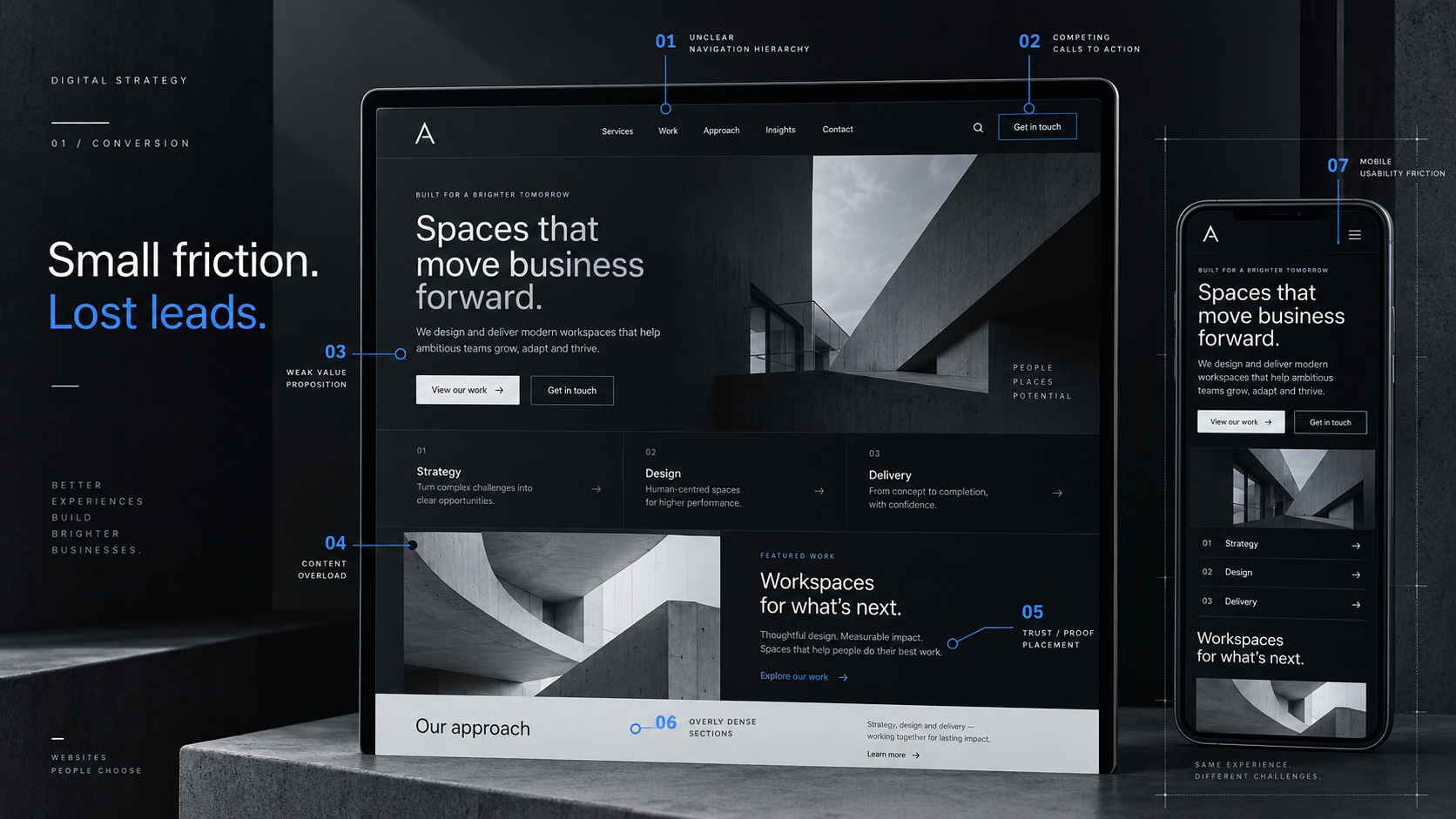
A business website can look polished and still lose good leads. The problem is usually not one dramatic flaw. It is a collection of small moments that make a visitor hesitate: a vague headline, too many choices, a slow page, weak proof, or a form that asks for too much too soon.
Those moments matter because people rarely arrive on a website with unlimited patience. They are trying to answer a few practical questions: Is this relevant to me? Can I trust this business? What should I do next? A strong website makes those answers easy. A weak one makes the visitor work for them.
Here are seven website mistakes that quietly cost businesses leads, plus the fixes that usually make the biggest difference.
1. Your homepage makes people work too hard
The first screen of a website should not read like an internal company presentation. Visitors should be able to understand what you do, who it is for, and what the next step is without translating vague phrases such as “future-ready solutions” or “transforming possibilities.”
Clear messaging does not mean boring messaging. It means the creative language sits on top of a useful idea. A strong headline can still have personality, but the supporting copy needs to remove ambiguity.
- Say what you actually help people buy, book, use, or achieve.
- Give the primary audience enough context to recognise that the page is for them.
- Place one obvious next action near the main message.
- Move supporting detail lower down instead of forcing everything into the hero.
A visitor should not need to scroll three sections before understanding the offer. If the opening is unclear, the rest of the page has to work much harder.
2. Every section is fighting for the click
More calls to action do not automatically create more conversions. A page with “Book a call,” “Get started,” “Learn more,” “Contact us,” “See pricing,” and “Download our guide” all competing at the same visual level can make the next step less obvious, not more.
The better approach is to decide what the page is meant to do. A service page might primarily move someone towards an enquiry. A case study might help them review proof first. A blog article might lead them to another useful resource before asking for contact.
You can still offer secondary actions, but they should feel secondary. Good conversion design is often about hierarchy rather than adding more buttons.
3. You are describing the business instead of helping the visitor decide
Many business websites are organised around how the company sees itself: departments, internal service names, awards, process language and long blocks about experience. Some of that information is useful, but it is rarely the visitor’s starting point.
People usually arrive with a problem, a goal or a question. They want to know whether you understand it, whether your offer fits, what working with you involves, and what evidence supports the decision.
That shift changes the copy. Instead of only listing features, explain why they matter. Instead of presenting every capability equally, group information around common needs. Instead of making people hunt for proof, place relevant work, testimonials or process details close to the claims they support.
4. Mobile feels like a smaller desktop
Responsive design is not finished when the desktop layout simply shrinks to fit a phone. Mobile users have less space, different interaction patterns and far less tolerance for awkward navigation, tiny controls or oversized sections.
A good mobile version often needs to be recomposed. Navigation may become a focused panel. Multi-column sections may need a different reading order. Decorative media can move below the core message. Forms should use comfortable controls and avoid unnecessary side-by-side fields.
- Check the order in which content stacks, not just whether it fits.
- Keep tap targets comfortable and important actions easy to reach.
- Watch for fixed elements that cover content or compete with the main CTA.
- Test real forms, menus and accordions instead of judging mobile from a static screenshot.
If the mobile site technically fits the viewport but feels tiring to use, it is responsive in code, not in experience.
5. The site is visually polished but slow
A beautiful page that takes too long to become usable creates friction before the visitor has even read the headline. Large images, unnecessary JavaScript, poorly loaded fonts and layout shifts can all make a premium-looking site feel less considered.
Performance work does not mean stripping every visual idea out of the design. It means being selective. Use the right image dimensions and formats. Load below-the-fold media when it is needed. Avoid animation that blocks interaction. Keep third-party scripts under control. Make sure the page remains stable while assets arrive.
Speed is part of the design because it changes how the design feels. The best interface is not just attractive in a screenshot; it responds quickly when someone actually uses it.
6. Trust appears too late
Businesses often treat trust as a separate testimonials section near the bottom of the page. That is useful, but visitors make trust decisions throughout the entire journey.
Trust can come from specific project examples, clear service descriptions, realistic claims, an understandable process, visible contact details, useful policies, thoughtful error states and consistent visual presentation. None of those elements needs to shout. Together they make the business feel credible.
The key is relevance. If a page makes a strong claim about a service, support it nearby with the most appropriate evidence. Do not make the visitor remember a promise and then search the rest of the site for a reason to believe it.
7. The contact form asks for a commitment before earning one
A contact form is often the final piece of friction between interest and an actual lead. Asking for every possible detail may make internal qualification easier, but it can also turn a simple enquiry into homework.
Ask for what you genuinely need to start the conversation. Name, contact details, the type of help required and enough context to understand the project are usually more useful than a long list of mandatory fields.
The experience after someone presses submit matters too. Validation should explain the specific problem, preserve the information already entered, and make success unmistakable. If something fails, the user should know what happened and what they can do next.
Fix the friction before adding more traffic
When a website is not generating enough enquiries, the instinct is often to push more traffic into it. Sometimes that is necessary. But if the page is unclear, slow, difficult on mobile or weak on trust, more visitors can simply mean more people encountering the same problems.
Start with the journey that already exists. Open the site as if you know nothing about the business. Can you understand the offer quickly? Is the next step obvious? Does the mobile experience feel intentional? Is there enough evidence to make the action feel safe? Can the form be completed without unnecessary effort?
That is what conversion-focused web design comes down to: clarity, confidence and momentum. When each part of the experience supports those three things, a website becomes more than a polished online presence. It becomes a practical part of how the business earns attention and turns it into real conversations.