
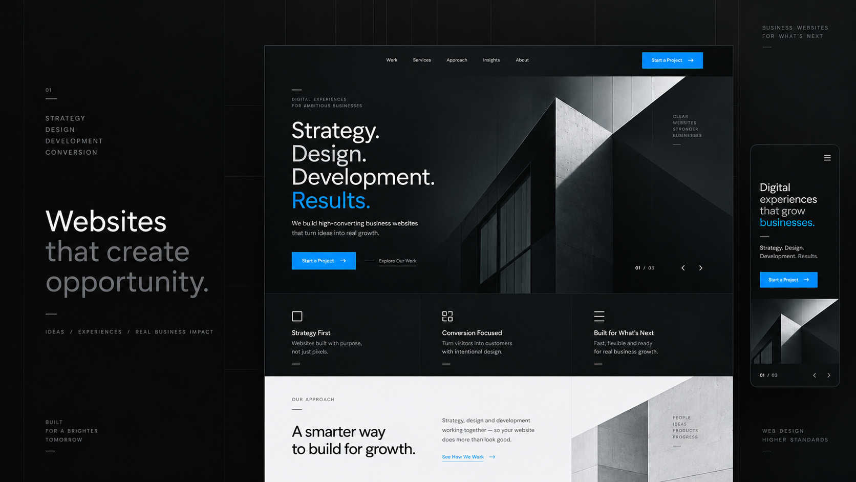
A business website can look impressive and still struggle to generate meaningful results. Strong visuals matter, but they are only one part of the experience. In 2026, the websites that perform best connect clear positioning, thoughtful design, useful content, strong performance and an obvious path for the visitor to take action.
Conversion does not always mean an immediate sale. Depending on the business, it might mean an enquiry, a quote request, a booked call, a product sign-up, a trial or another meaningful next step. The job of the website is to make that next step feel clear, relevant and easy.
Start with clarity, not decoration
Visitors should quickly understand what the business does, who it is for and why it matters. If those answers are buried under vague headlines, decorative effects or long introductions, even a beautifully designed homepage can lose attention.
A strong hero section does not need to explain everything. It needs to communicate one clear idea, support it with enough context and give the visitor an obvious way to continue. Visual design should reinforce that message rather than compete with it.
Give every page a purpose
A high-converting website is not a collection of pages that all say roughly the same thing. Each page should have a specific job. A service page should help someone understand the offer and decide whether it fits. An About page should build confidence. A contact page should reduce friction around starting a conversation.
A useful question during planning is simple: what should the visitor understand on this page, and what should they be able to do next? That keeps content focused and prevents the website from becoming a collection of disconnected sections.
Make the next step obvious
Calls to action work best when they feel like a natural continuation of the page. A visitor should not need to search for what to do next or interpret vague labels. Clear actions such as Start a project, Request a quote or Book a consultation usually communicate more than generic wording.
The goal is not to place a button everywhere. It is to create a deliberate conversion path through the page so that the primary action appears at the moments where the visitor has enough context to consider it.
Design for mobile as seriously as desktop
Mobile design is not simply the desktop layout made narrower. The hierarchy, spacing, navigation, content order and interaction patterns need to work naturally on smaller screens. Important information should remain easy to find without forcing users through unnecessary scrolling or awkward interfaces.
The strongest responsive experiences preserve the same clarity and priorities across screen sizes while adapting the presentation to the space available.
Speed is part of the experience
A polished design loses value if the website feels slow. Large images, unnecessary scripts, oversized video and excessive animation can make an otherwise strong experience frustrating. Performance should therefore be treated as a design concern, not only a technical task.
Images should be appropriately sized, media should be optimized, scripts should be intentional and motion should support the interface rather than delay it. A responsive website often feels more trustworthy simply because every interaction happens when the user expects it to.
Build trust before asking for action
People are more likely to take the next step when the website gives them reasons to trust the business. Useful project examples, clear service information, genuine contact details, transparent process explanations and verified testimonials or results can all contribute to that confidence.
Trust should come from real evidence rather than inflated numbers or invented authority. If a business cannot support a claim such as hundreds of successful clients or dramatic conversion increases, the website is better served by specific, truthful evidence of the work and the way it is delivered.
Make content easy to scan
Most visitors do not read every sentence from the top of a page to the bottom. Clear headings, short paragraphs, useful spacing and well-organized sections make it easier to understand the important points quickly. Simpler language often feels more professional because the visitor does not have to decode what the business is trying to say.
Accessibility improves the website for everyone
Readable contrast, sensible text sizes, keyboard-friendly navigation, meaningful alternative text, properly labelled forms and predictable interactions make a website easier to use for a wider range of people. These practices also tend to improve general usability because they force the interface to communicate more clearly.
Do not design around trends alone
Design trends can make a website feel current, but they should not determine its structure. Oversized typography, animation, unusual navigation or experimental layouts can be effective when they support the message. When they become the main idea, they can make simple tasks harder.
Clear positioning, strong hierarchy, readable content, good performance and straightforward interaction tend to age better than visual gimmicks. Trends can sit on top of those fundamentals rather than replacing them.
Measure what happens after launch
Launching the website is not the end of the work. Real visitor behaviour can reveal where people hesitate, which pages attract attention and where conversion paths break down. Those observations are more useful than making changes based only on assumptions.
Iteration should remain purposeful. The goal is not to continuously redesign the website, but to improve the parts of the experience where there is a clear reason to do so.
A high-converting website is a connected system
There is no single button, layout pattern or headline formula that creates a high-converting website. Results come from how positioning, design, copy, performance, trust and calls to action work together. Weakness in one part of that system can reduce the impact of everything around it.
The best business websites in 2026 are not necessarily the loudest or the most complicated. They are the ones that help visitors understand the offer, trust the business and move toward the right next step with as little friction as possible.
Building a new website or rethinking an existing one?
FusionAura Studio shapes and builds digital experiences around clear strategy, thoughtful design and purposeful development. If your website needs to communicate more clearly and create a stronger path from attention to action, start a project with us.