
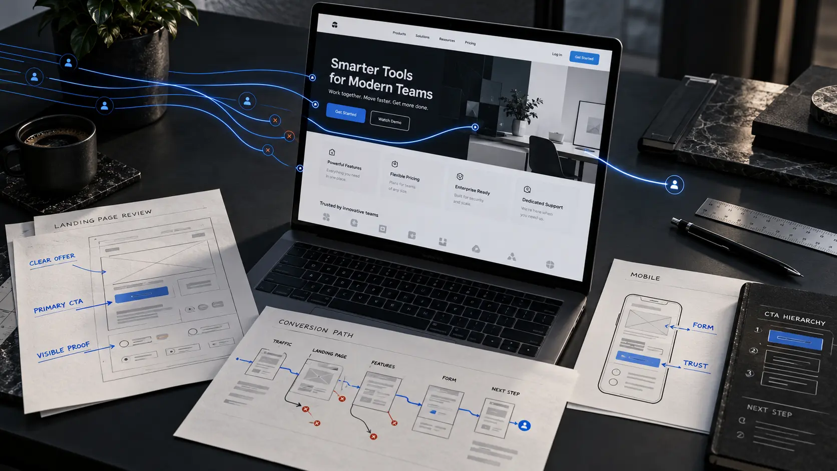
Your traffic graph is moving. People are finding the website. Ads are getting clicks, search impressions are rising, or social posts are sending visitors across.
But the enquiries are not following.
At that point, the obvious reaction is usually: we need more traffic.
Sometimes that is true. Often it is not.
If the right people are already reaching the website and very few are taking the next step, increasing traffic can simply send more people into the same weak journey.
The better question is:
Where does a qualified visitor lose enough clarity, confidence or momentum to stop?
This guide walks through that problem in the order we would actually investigate it — from traffic quality and tracking to the page itself, the call to action, mobile experience and what happens after somebody finally gets in touch.
Quick answer: why does a website get traffic but no leads?
A website can receive traffic without producing leads for several very different reasons.
The visitors may not be the right people. The page may not match what brought them there. The offer may be difficult to understand. Proof may appear too late. The call to action may create uncertainty. The contact process may ask for too much. Or genuine enquiries may be arriving and getting lost after the form is submitted.
That is why “get more traffic” is not a diagnosis.
Before increasing ad spend, publishing more content or chasing additional rankings, find out which part of the journey is actually failing.
1. First, confirm that you really have a conversion problem
This is the step people skip because it feels less exciting than changing a homepage.
Before redesigning anything, make sure your measurement works.
If a phone call is a lead, is call tracking configured correctly? If a form submission is a lead, does the thank-you event fire? If people contact the business through WhatsApp, live chat or email, are those actions being counted anywhere?
A dashboard can make a healthy page look broken when half the useful actions are invisible to the analytics setup.
The opposite can also happen. A form can report a “conversion” even when spam, duplicate submissions or low-quality enquiries make the number commercially meaningless.
Start with the real outcome you care about — qualified enquiries, booked calls, quote requests, sign-ups or purchases — and work backwards.
Do not redesign a website to fix a tracking problem.
2. Check whether the traffic has the right intent
Not every website visitor is equally valuable.
A person reading an educational article may simply be researching. Someone searching for a provider, pricing, availability or a specific service is much closer to making a decision.
That difference matters.
A business can double its traffic by ranking for broad informational topics and still see almost no change in enquiries. The traffic is real; it just has a different purpose.
Separate your traffic by source and intent before judging the website.
Look at which landing pages receive visits, what search queries bring people there, which ads generate the clicks, and whether the visitor reasonably belongs to the audience the business wants to serve.
If the traffic is mostly low-intent, the next move may genuinely be better targeting rather than a redesign.
If high-intent visitors are reaching relevant pages and still doing nothing, keep going.
3. Make sure the page matches the promise that earned the click
A visitor should not have to reinterpret your offer after arriving.
If an ad promotes commercial roof repair, the landing page should immediately look and read like a page about commercial roof repair.
If somebody searches for freight dispatch services and lands on a generic homepage that spends the first screen talking about “innovative logistics solutions,” the connection has already weakened.
Google Ads explicitly treats landing-page relevance, usefulness and ease of navigation as part of landing-page experience. Its guidance also recommends matching the landing page to the message and call to action used in the ad. Google Ads explains the principle here.
This is not just an advertising issue.
The same mismatch happens with SEO, social media and email campaigns.
A visitor clicked for a reason. The first screen should confirm that they arrived in the right place.
4. Your offer may be harder to understand than you think
Business owners know their own company too well.
That makes it surprisingly difficult to see when a website is vague.
A headline such as “Building Better Solutions for Tomorrow” may feel polished internally, but it leaves a new visitor with basic unanswered questions.
What do you actually do?
Who is it for?
What kind of problem do you solve?
A clear offer does not need to explain the entire business in one sentence. It simply needs to give the visitor enough orientation to keep reading.
For example:
Commercial roof repair for businesses across Georgia gives someone a much firmer starting point than Reliable solutions built around your needs.
The first sentence can still lead into better writing, stronger design and a richer story. It simply does not make the visitor decode the category first.
If you want a broader framework for this, we covered it in What Makes a High-Converting Business Website in 2026?.
5. The website may be asking for trust before showing enough evidence
Most business websites make claims early.
Experienced. Reliable. Trusted. Professional. Results-driven.
The problem is not using those words. The problem is expecting the words to do all the work.
A visitor deciding whether to enquire wants reasons to believe the business can actually deliver.
That evidence might be completed work, project details, recognised clients, named testimonials, specialist knowledge, process transparency, certifications, real product screenshots or simply a clear explanation that demonstrates the company understands the problem.
Where that proof appears matters too.
If the strongest project, testimonial or technical evidence is buried near the footer, many visitors will reach the call to action before they have been given enough reason to use it.
A good page does not dump every trust signal into one section called “Why Choose Us.”
It distributes proof through the journey.
6. Too many calls to action can make the next step less obvious
One of the fastest ways to weaken a page is to treat every possible action as equally important.
Book a call.
Request a quote.
Learn more.
Explore services.
Download the guide.
View projects.
Contact us.
Follow us.
Each action may be reasonable on its own. Put them all in front of a new visitor at the same visual level and the page stops giving direction.
This does not mean a website should have only one link.
It means the page should have a clear hierarchy.
What is the primary action for somebody who is ready?
What is the secondary path for somebody who needs more evidence first?
Those two questions usually produce a cleaner experience than adding another button because somebody might want it.
Google’s own landing-page guidance makes a similar practical point: make it quick and easy for visitors to perform the action you want them to take rather than forcing them to hunt around for it. See Google’s landing-page recommendations.
7. The contact process may create more friction than the page
You can build a clear, credible page and lose the lead in the final thirty seconds.
This usually happens at the form.
A visitor wants a quote and gets twelve required fields.
A person wants to book a consultation and has to create an account.
A mobile user taps the phone number and discovers it is not actually clickable.
A form submits successfully but gives no confirmation, leaving the visitor wondering whether anything happened.
The amount of information you ask for should match the commitment the visitor is making.
If someone is simply asking whether you can help, you probably do not need their full procurement profile before responding.
You can qualify later.
There are cases where longer forms are useful — complex B2B projects, applications or regulated workflows, for example. But the extra fields should exist because the business needs them, not because the form template included them.
8. Mobile and performance can quietly break an otherwise good journey
A page can look excellent on the designer’s laptop and become a completely different experience on a phone.
Buttons move below the fold. Headlines occupy most of the first screen. Large desktop sections turn into long stacks. Forms become awkward. Images load late. Sticky elements cover content.
Those problems do not always look dramatic in analytics. They simply make every step slightly harder.
Google’s current Search guidance recommends looking at page experience as a whole, including Core Web Vitals, mobile presentation, security and whether the main content is easy to distinguish and use. Google also makes an important qualification: page experience is not one magic ranking signal, and perfect scores do not guarantee top rankings. Google Search Central explains its current page-experience guidance here.
That is the right way to think about performance too.
A fast website with a confusing offer can still fail.
A beautifully written website that feels sluggish and unstable on mobile can still lose momentum.
Performance supports the journey. It does not replace it.
9. The leak may happen after the visitor becomes a lead
This is the part a website audit can easily miss.
Suppose somebody completes the form.
Where does that enquiry go?
Does it reach the right person?
Is there an automatic acknowledgement?
Does somebody manually copy the details into a CRM?
Can the enquiry sit unnoticed in an inbox for a day?
Does the sales team know which page or campaign generated it?
If the handoff is weak, the website can appear to have a “conversion problem” when the real issue is operational.
We think about websites as part of a wider system for exactly this reason.
The form is not the end of the customer journey. It is the point where the public experience hands the opportunity to the business.
If that handoff fails, improving the button colour will not save it.
A practical diagnostic: symptom, likely cause and first thing to check
| What you see | Possible cause | Check first |
|---|---|---|
| Traffic rising, leads flat | Traffic intent or conversion-path problem | Landing pages, search queries and lead rate by source |
| Paid clicks but very few enquiries | Ad-to-page mismatch | Whether the page directly reflects the ad promise |
| People reach the homepage but rarely contact | Unclear offer, weak proof or weak CTA | First screen, proof placement and primary next step |
| Desktop performs better than mobile | Mobile friction or performance | Real phone experience, forms, sticky elements and loading behaviour |
| Forms start but are rarely completed | Form friction | Required fields, errors, mobile inputs and commitment level |
| Forms submit but sales says lead volume is low | Tracking or handoff problem | Inbox delivery, CRM routing, spam filtering and response process |
When is more traffic actually the right answer?
There is a danger in turning “fix your conversion rate first” into another absolute rule.
Some websites simply do need more qualified visitors.
If the page is clear, the traffic matches the offer, enquiries arrive at a healthy rate for the business, and the sales process handles them properly, then increasing qualified traffic may be exactly the next move.
The point is not to avoid acquisition.
It is to avoid scaling acquisition before you know what the destination does with the attention you are buying.
If you are paying for every click, this becomes especially important.
Google Ads itself says landing pages play a major role in turning clicks into customers and recommends clear calls to action, simple navigation, mobile usability and close alignment between the ad and the destination.
What we would fix before increasing traffic
If we opened a business website today and found relevant traffic but weak enquiries, we would not start by redesigning every page.
We would look for the narrowest point in the path.
Is the first-screen offer unclear?
Fix that first.
Is the offer clear but unsupported?
Move the strongest evidence into the decision path.
Are visitors convinced but faced with six competing actions?
Create a stronger hierarchy.
Does the page work but the form create unnecessary work?
Simplify the final step.
Does everything work until the lead enters the business?
Fix the handoff.
This approach is less dramatic than replacing an entire website, but it is usually more useful.
A redesign becomes justified when the problems are connected: messaging, hierarchy, proof, mobile behaviour, CMS limitations and technical structure all fight against each other.
That is the point where repairing individual pieces can become more expensive than rebuilding the experience properly.
We covered that distinction in more detail in When Should You Redesign Your Website?.
What this looks like in real project work
Different businesses need different kinds of clarity.
For Eren Logix, a freight dispatch and logistics business, the experience needed to establish the service quickly, make the operational nature of the business feel credible, and give prospective clients a clear route into the next step.
That meant strong positioning, service hierarchy, deliberate calls to action and a visual system suited to logistics rather than dropping the company into a generic business template.
Dua Nadeem required a different kind of trust.
There, editorial hierarchy, expertise and content presentation mattered more than cinematic logistics imagery.
FurShield had another challenge again: it is a multi-role product. Owners, veterinarians and shelters need different paths through the same system, so clarity comes from architecture and role-aware workflows rather than one marketing CTA.
The visual styles are different because the jobs are different.
The principle underneath them is the same:
The website should make the next useful decision easier.
SEO will not rescue a page that disappoints the visitor
SEO and conversion are separate disciplines, but they meet on the landing page.
Ranking for the right query earns an opportunity.
The page still has to satisfy the person who arrives.
That is also why writing for search engines first is a weak long-term strategy.
Google’s current guidance for Search — including its generative AI experiences — continues to emphasise useful, original, people-first content and normal SEO fundamentals. It specifically advises publishers to focus on valuable non-commodity content rather than chasing special “AEO” or “GEO” tricks.
For a business website, that means being specific.
Explain the service properly. Answer the questions real buyers ask. Show evidence. Use language customers actually use. Keep pages technically accessible and easy to navigate.
Those choices help search visibility and human decision-making at the same time.
Before you buy more traffic, answer these questions
You do not need a fifty-point CRO checklist to find obvious friction.
Open the website as if you have never seen the business before.
Can you tell what it does?
Can you tell who it is for?
Can you find a reason to trust it?
Is there an obvious next step?
Does that step work comfortably on a phone?
Does the enquiry reach somebody who can act on it?
If the answer breaks at any point, that is where we would investigate before buying more traffic.
The traffic is not the finish line
Traffic means somebody gave you attention.
That matters.
But the website still has a job after the click.
It has to orient the visitor, explain the offer, support the claims, reduce unnecessary uncertainty and make the next step feel reasonable.
More visitors can amplify a strong journey.
They can also amplify a weak one.
So before asking how to send another thousand people to the site, ask whether the people already arriving have a clear path forward.
Fix the path first. Then scale the traffic.
Getting traffic but not enough enquiries?
We can review the path from first impression to enquiry and identify where the website is losing clarity, trust or direction.
Frequently asked questions
Why is my website getting traffic but no leads?
The most common causes are poor traffic intent, a mismatch between the visitor’s expectation and the landing page, an unclear offer, weak proof, a confusing call to action, form friction, mobile problems or a broken lead-handling process. Start by checking tracking and traffic quality before assuming the website itself is the only problem.
Should I increase website traffic if conversions are low?
Not automatically. If qualified visitors already reach the site and very few take action, increasing traffic may simply scale the same conversion problem. Find the bottleneck first. If conversion is healthy and the audience is relevant, more qualified traffic may then make sense.
How do I know whether my traffic is low quality?
Review the source, search queries, landing pages and behaviour of visitors. Informational traffic, broad social traffic and poorly targeted ads can increase sessions without increasing commercial intent. Compare lead quality and conversion by source rather than judging all traffic as one group.
What should a landing page show first?
A visitor should quickly understand what is being offered, whether it is relevant to them and what they can do next. Important proof and the primary call to action should be easy to find without forcing the visitor to search through the page.
Can a website redesign increase leads?
A redesign can improve the conditions that support lead generation by making the offer clearer, strengthening proof, improving mobile usability and simplifying the next step. It cannot guarantee leads on its own; traffic quality, the offer, pricing, competition and sales follow-up still matter.
Does website speed affect conversions and SEO?
Performance affects how easy and comfortable a page is to use, particularly on mobile. Google also includes Core Web Vitals within its broader page-experience guidance. Speed is important, but it should be improved alongside relevance, clarity and usability rather than treated as the only metric that matters.
What should I fix first if my website is not converting?
Confirm tracking first. Then check traffic intent, message-to-page relevance, offer clarity, proof, the primary call to action, contact friction, mobile usability and lead follow-up in that order. Fix the earliest point where qualified visitors lose momentum.
Sources and further reading
Google Ads — Optimise your ads and landing pages
Google Search Central — Understanding page experience
Google Search Central — Guidance for generative AI search experiences