
Website experience
SOLENNE — Architectural Website
An internal architectural website concept combining expressive imagery, a responsive layout and an interactive construction journey.
Visit live site- Category
- Internal Concept
- Year
- 2026
- Services
- Website Design & Development
- Technology
- React · JavaScript · Vite
Project overview
SOLENNE — Architectural Website, in context.
- Year
- 2026
- Project type
- Internal Concept
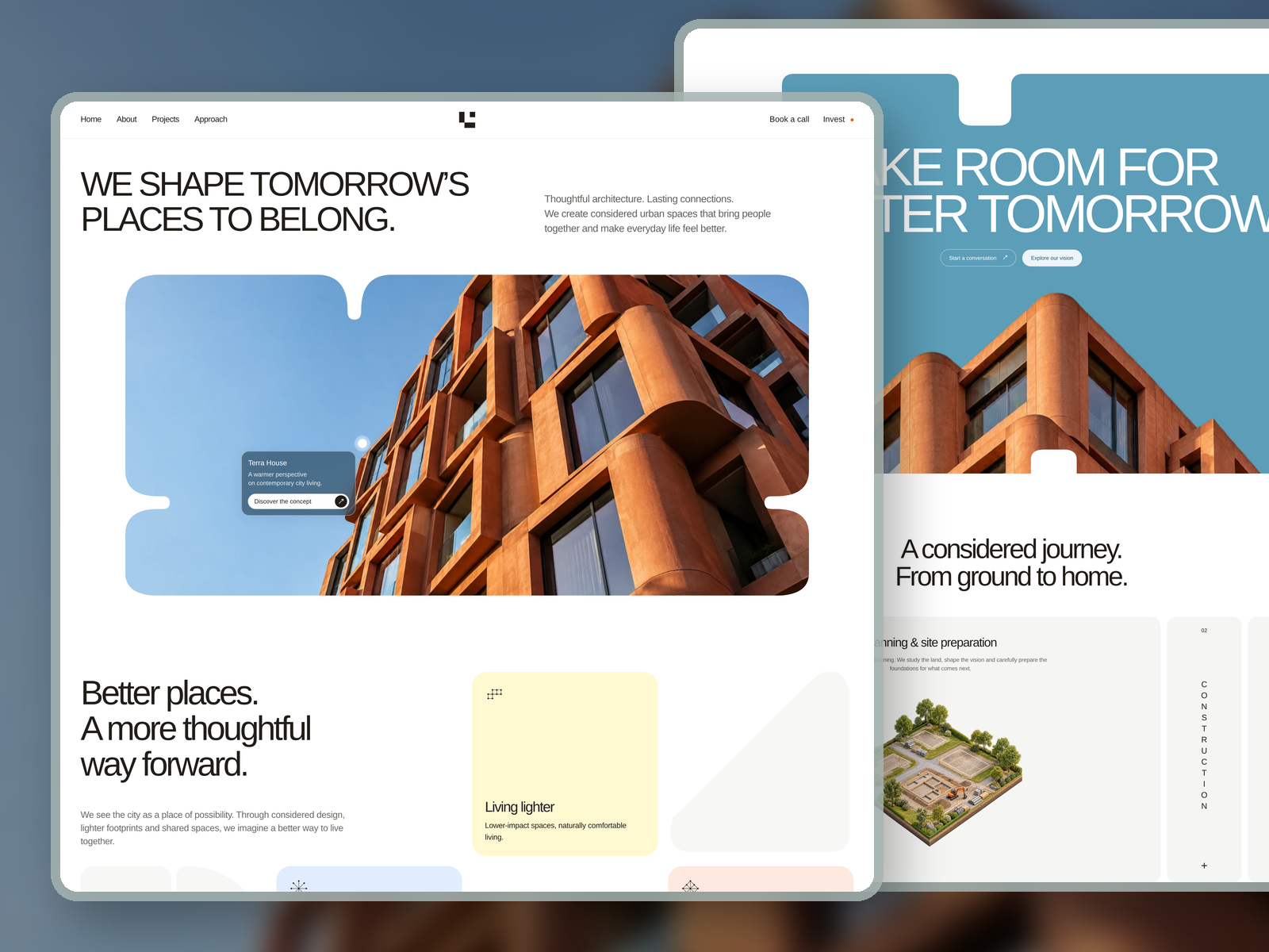
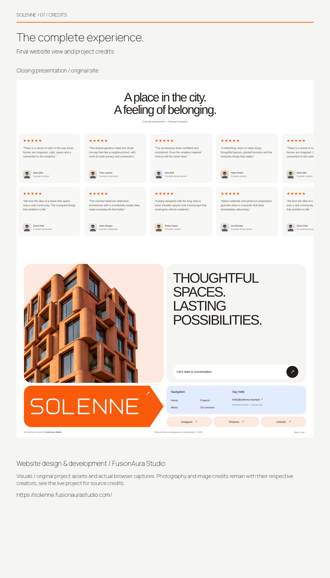
SOLENNE is an internal architectural development concept designed and developed by FusionAura Studio. It explores how a development brand can present its vision, values and residential projects through a clear, expressive digital experience.
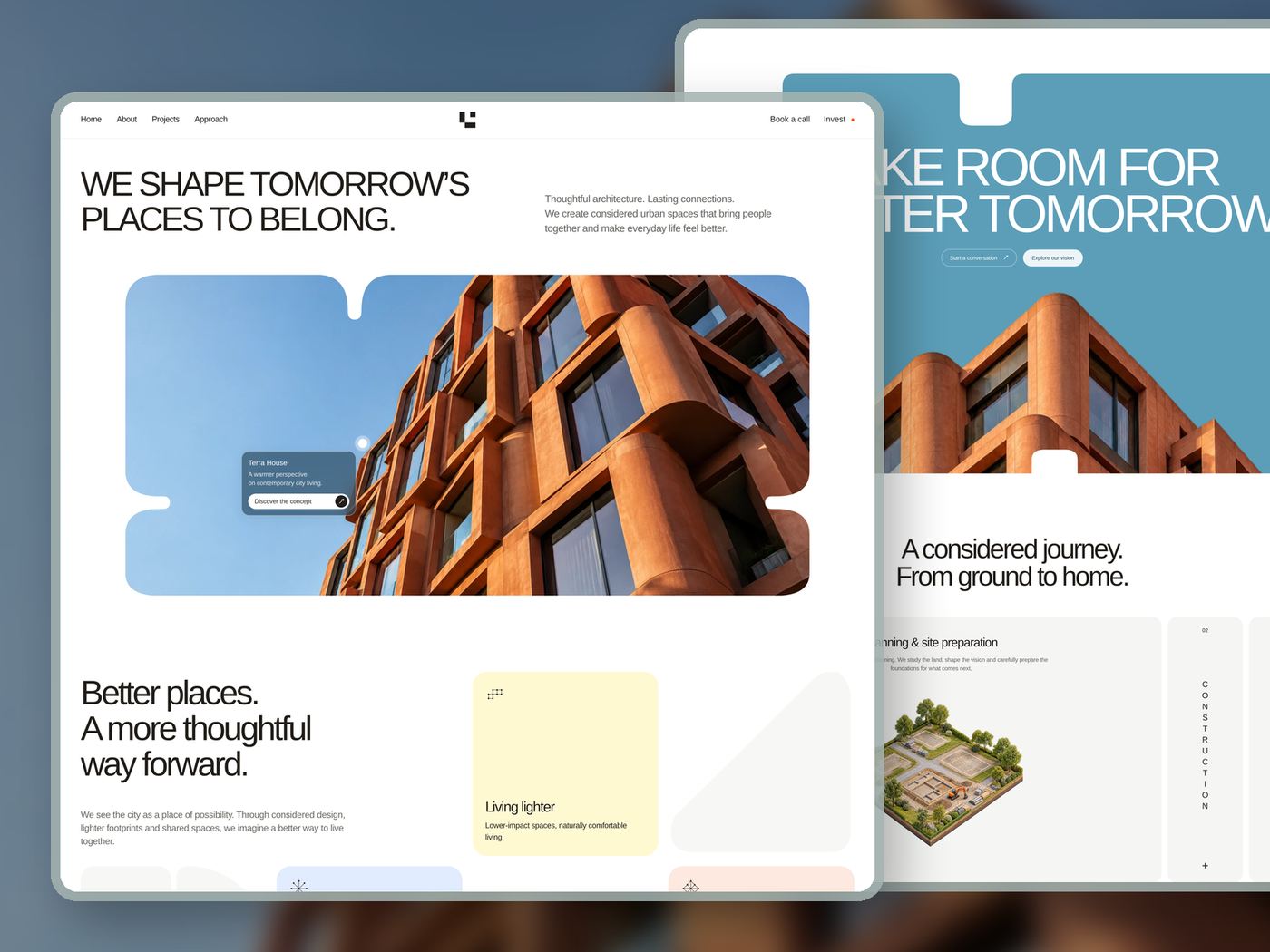
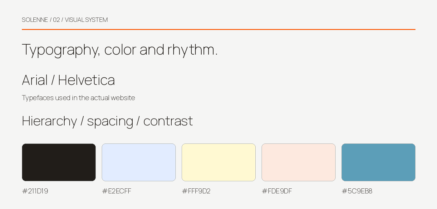
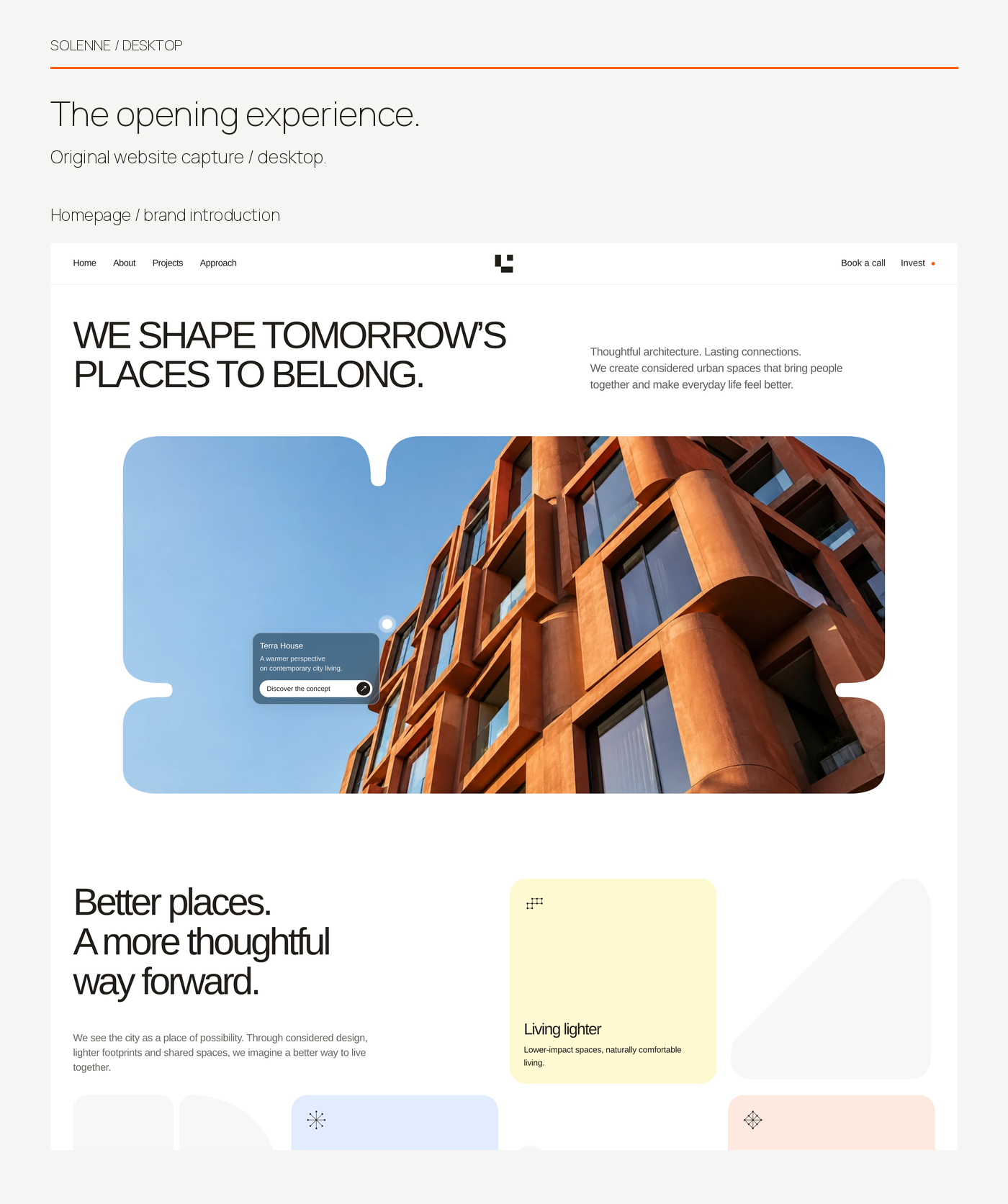
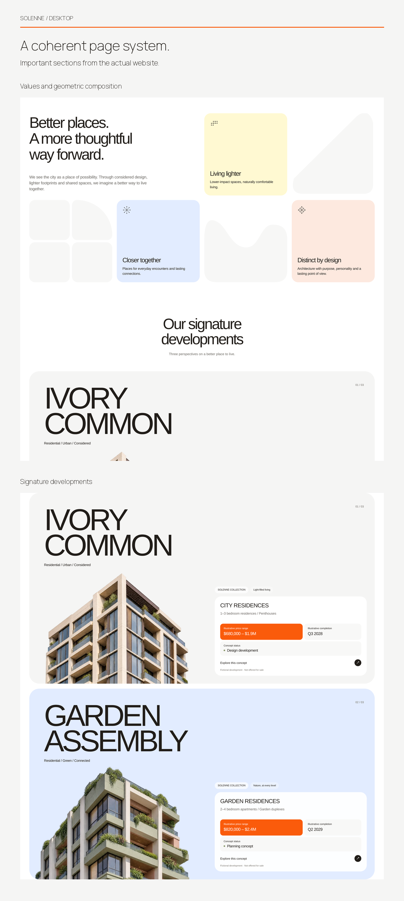
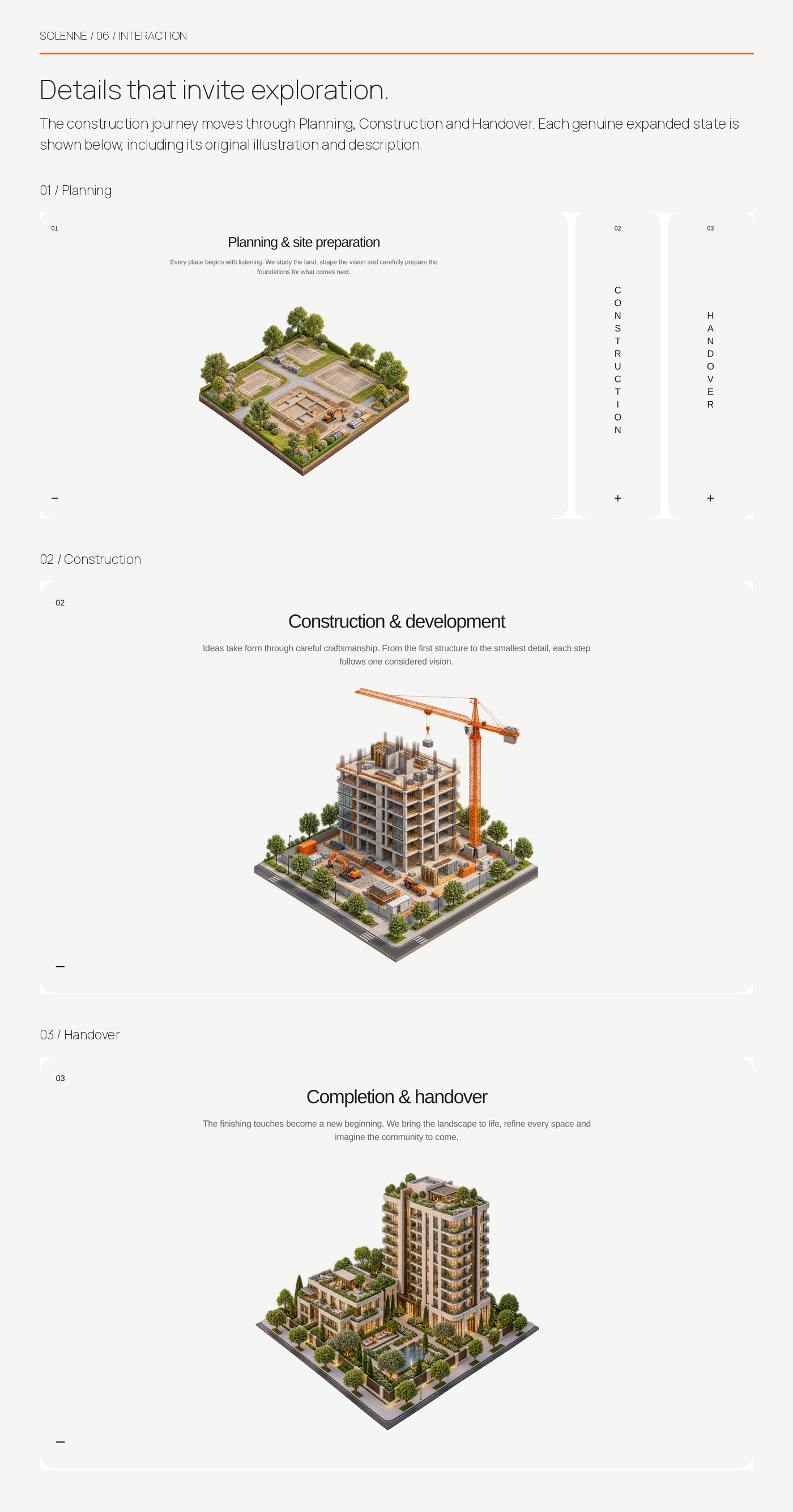
The responsive website combines warm architectural imagery, curved image masks, oversized typography and pastel content cards. Its Construction Journey explains Planning & Site Preparation, Construction and Handover through an interactive accordion with distinct illustrations and descriptions.
The brand and developments are illustrative. This is self-initiated concept work; no client commission, business results or client testimonials are claimed.
This case study describes verified project scope and delivered work. It does not make unverified external outcome claims.
Project system
Services and technology.
Services
Technology
- React
- JavaScript
- Vite
Problems and responses
Challenges, made clear.
- 01
Challenge
Communicate an architectural development story without reducing the experience to a conventional property listing.
Solution
Combine warm photography, curved image treatments and a clear hierarchy of vision, values and project showcases.
- 02
Challenge
Explain the construction process as a sequence visitors can actively explore.
Solution
Create a three-stage accordion for Planning & Site Preparation, Construction and Handover, each with its own illustration and description.
- 03
Challenge
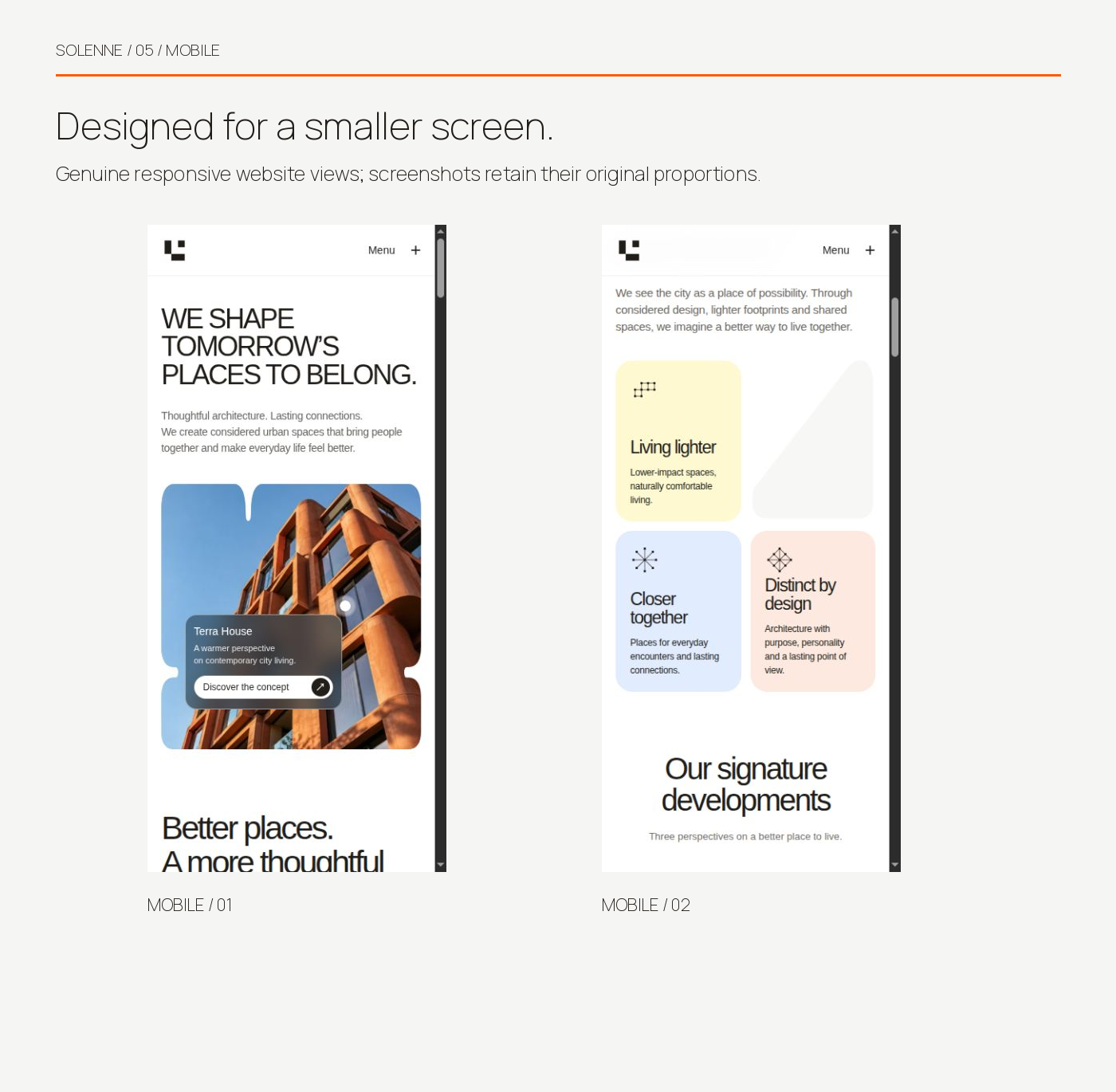
Preserve the expressive desktop design on smaller screens.
Solution
Adapt typography, image masks, content cards and navigation for responsive mobile layouts.
Approach
How the project came together.
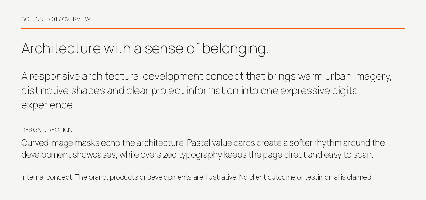
Build a visual language around architectural curves, open space and restrained pastel color. Use large headings and structured development showcases to make the page easy to scan.
Implement the experience in React and JavaScript with Vite. Adapt layouts for desktop and mobile, and give each construction phase its own accordion state so the process can be explored in context.
Interface study
A closer look.
Explore the selected project views with swipe, trackpad or keyboard controls.
01of08
Drag or swipe to explore
Outcome
A working, publicly accessible architectural website concept with responsive desktop and mobile layouts, development showcases and all three construction journey states. The portfolio presentation uses genuine screenshots of the implemented experience.
Thinking behind the work
Start a project
Ready to build something useful?
Tell us what you are planning and where you need support. We will respond with practical next steps.